Why Mobile-Friendly Websites Matter in 2026
A mobile-friendly website helps customers read, browse and act with confidence wherever they discover your business.
By Blue Black Beige
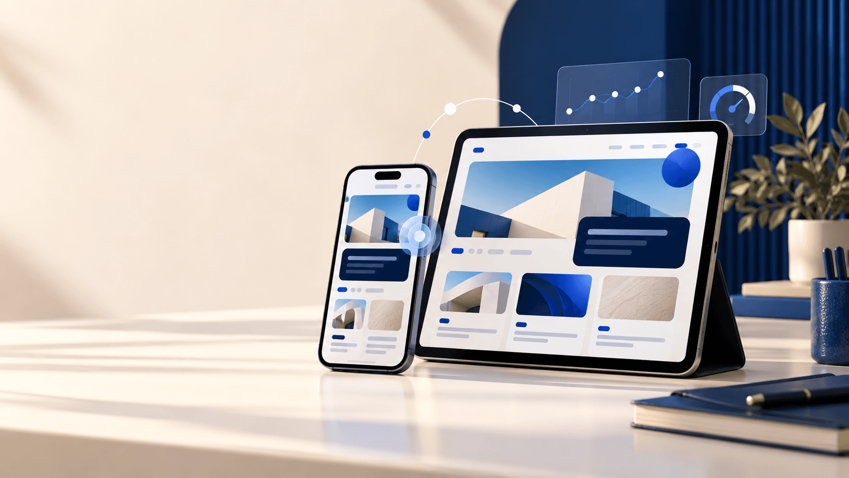
People use a phone to search for information, compare options, read reviews and contact a business throughout the day. A mobile-friendly website adapts its layout, images, type and interactions to the screen in front of the visitor.
Mobile is where many customer journeys begin
When the page loads quickly and the next action is easy to understand, the business feels more reliable. When the layout is cramped or difficult to tap, visitors often leave before they see the offer.
"Responsive design is part of customer service because the screen is part of the conversation."
Common mobile website problems
Desktop-first websites can hide small problems that become major obstacles on a phone. These issues affect usability, search visibility and the number of people who complete an enquiry.
- Slow loading pages and oversized images.
- Small text, cramped layouts and buttons that are hard to tap.
- Menus that hide important pages or make navigation confusing.
- Forms that are difficult to complete with a phone keyboard.
- Content that shifts while the visitor is reading or clicking.
What a mobile-friendly website should do
Responsive web design should preserve the meaning of the page while making the decision path simpler on a small screen. The layout should prioritise the message, the proof and the primary action without forcing the visitor to zoom or hunt.
- Use readable type, strong contrast and comfortable spacing.
- Reserve space for media so the page does not jump as it loads.
- Keep phone, email, booking and enquiry actions easy to reach.
- Test menus, forms and tap targets on real mobile devices.
- Check the page on a slower connection before publishing.
Mobile performance supports long-term growth
A mobile-first approach supports search visibility, accessibility and conversion at the same time. The goal is not only to fit a desktop page into a smaller box. It is to create a clear, fast and respectful experience for customers in real conditions.
For a local business, a mobile-friendly website can be the difference between a search visit and a phone call. For an online brand, it can shape whether a product is understood, trusted and purchased.